
In many of the presentations I have been required to sit through, I have been subjected to a barrage of data. But in order to be successful, PowerPoint presentations should contain more than mere facts.
Irrespective of the topic, the purpose of most presentations is to communicate an engaging message which sticks in the minds of the audience and persuades them to do something – to think, to change or to act. This certainly applies in the context of teaching and learning.
Engaging message
To engage with our learners, we should have a clear idea about who they are and what motivates them. In education, this usually comes under the headings of ‘differentiation’ and ‘equality and diversity’.
A presentation should take the form of a conversation instead of a lecture. The aim here is to make connections by developing talking points throughout the presentation, rather than reading from a script.
Sticks in the minds
The more visual the presentation, the more memorable it will be. If the content is interactive and not simply passive, making learners think and giving them things to do, this will stay with them for much longer and also makes for a more engaging presentation.
We can achieve this by incorporating colour, video, illustration, and photography. There’s an added bonus if the visuals relate to something the learners are already familiar with.
Persuasive
A persuasive statement consists of a conclusion (the idea or course of action we want our learners to adopt), supported by reasons, evidence, examples, analogies, anecdotes, and explanations.
The philosopher Aristotle suggested that the following three types of argument are required to be persuasive:
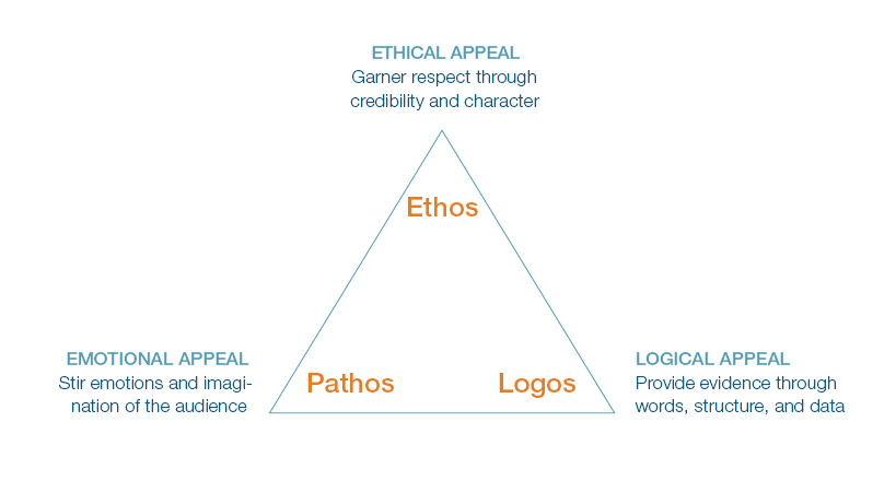
Credibility enables tutors and learners to connect via shared values and has a significant impact on the quality of learning. This was discussed in an earlier blog post on teacher credibility.
Telling stories is a very powerful way to prompt an emotional response in learners, which minimises the risk of them becoming passive. Stories about how techniques can be applied in the workplace and success stories about alumni can be used to cement their understanding and make learning outcomes more tangible. If they are given opportunities to tell their own stories, this is even more engaging.
Presentations must have a logical structure; in the same way that we would compose a story with a clear introduction, development of the main points, and a conclusion. The flow of the slides should make sense and visuals should support and not distract from the main message.
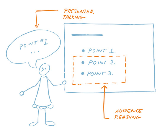
The biggest mistake people make is to jampack their slides with information – full paragraphs, long quotes, and wordy bullet points. The less clutter, the more powerful the message.
Finally, we also need to think about how the content of our slides is revealed in order to maintain focus and maximise stickability:
If you use a plethora of words, your audience will read the slide more quickly than you can explain it, making you strangely irrelevant to your own presentation
Nancy Duarte
Further Reading
Duarte, N. (2008) Slide:ology The Art and Science of Creating Great Presentations: O’Reilly Media Inc.
Duarte, N. (2010) Resonate: John Wiley and Sons Inc.
Duarte, N., and Sanchez, P. (2016) Illuminate: Portfolio Penguin
Krystian, M. (2016) ‘How To Design Powerpoint Presentations That Pack A Punch – In 5 Easy Steps’. Infogr.am Blog. 7th January 2016. Available at: https://blog.infogr.am/how-to-design-powerpoint-presentations-that-pack-a-punch/ [Accessed: 10th September 2016]
Lally, J. (2008) OCR AS Critical Thinking. Harlow: Heinemann.
Shattuck, S. (2016) ‘The Science of Effective Presentations’. Prezi Blog. 7th June 2016. Available at: https://blog.infogr.am/how-to-design-powerpoint-presentations-that-pack-a-punch/ [Accessed: 19th September 2016]


